Lee Towndrow is a visual artist based in New York. He began his career as a designer and photographer at a designer firm which he founded, the firm was best known for its work creating the album covers for Canadian bands such as Sloan, The Flashing Lights, The Inbreds and Michelle McAdorey. He then became a flame artist where he created visual effects and designs for TV commercials, music videos and feature films. He moved to Beunos Aires briefly between 2004 and 2005 where he worked with Roberto Jacoby. His work appeared in Time Magazine, The Paris Review and Das Magazine.
I chose his work because I think he uses and represents the formal element of colour very well. He does this by using very bright colours and also by contrasting the bright colour with other colours such as white or black backgrounds.
This image shows a dog wearing a ginger wig, this image shows colour very well because the dog and the background are all white and this contrasts very well with the ginger wig. I like this image as i think it is quite usual how he has placed the wig on the dog and then made it seem as if the dog is flipping its hair to the side. The use of the copper coloured necklace is also very effective at showing colour because again it contrasts with the dogs white fur and the white background.
This image shows a man wearing a black hood and white outfit and they have had yellow paint poured over their head, I think this photograph is very effective at showing colour because the hood and background are black, the outfit is white and these are both very dull, basic colours and then the yellow paint is poured over the person and the yellow is very vibrant and stands out very well. The fact that they have photographed the paint dripping was also very effective at showing colour because it is over the black in strands ad this looks very unusual.
This image shows a women's face, The women has turquoise hair and is also wearing a pink swimming cap and pink outfit. There is a lot of contrasting of colour within this image, for example there is bright pink on the swimming cap, on the women's outfit and also in the women's bright pink makeup. The pink contrasts very well with the turquoise background and also the turquoise hair and finally the natural colour of the women's skin tone also contrasts again. I like this photo because it is very bright and the colours and vibrant and contrast with eachother. I also like the whole composition because the colours seem to be separated with the turquoise on the left and the pink on the right.
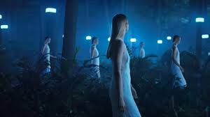
This photo is not a very clear photograph showing colour however in my opinion it does show colour because of all the very blue tones within the image. There is a lot of blue lighting within this image and because of this the entire image looks blue, for example the woman's dress is a light shade of blue and there is a blue shaded mist. The blue lights are also reflected off of the trees and this makes the entire image very blue. I think this image is very interesting as it also includes the repetition of the woman in the thin dress walking in different areas in the image. There is leo the repetition of the lights in the image.
Influence
I find Lee Towndrows work to be very influential, in my opinion he fills the compositions of all of his pieces very well as they do not have to be extremely busy however they are still interesting and eye-catching. I also think Towndrow uses colour very effectively by either using very similar colours within an image or by doing the opposite and using colours with completely contrast with each other.
Summary
I like Towndrow's style because I do think he has a rather unique style in using colour. His work also interests me very much with the use of bold colours and I would quite like to study him further and maybe try his style within my own work. The only improvisation I could make to his work would be to use a wider range of subjects, for example the first three images above use contrast to show the colour.


No comments:
Post a Comment