Thursday 18 December 2014

Final Pieces


Final Evaluation

When we started our photography A level we focused on the topic of the 10 formal elements; Line, Colour, Pattern, Depth, Texture, Tone, Form, Movement, Shape and Reflection. We looked at this because if we can focus on one particular element within a photograph it will help the way we photograph an image and also when evaluating an image. Towards the beginning of the topic I struggled to see what would consist of the formal elements however after a few lessons and further explanation from the teacher it gradually became easier and now towards the end of the topic I find it much easier to focus on them. I think the formal elements were a very good topic to start with because they helped to expand our knowledge and understanding of photography and the skills I have gained from this topic will help me in our next units.

I found it very difficult to photograph some topics such as depth however once I had done one shoot and gotten the teachers opinion and advice I felt that if I was to go and photograph the same topic again I would not struggle as much as the first time. My favourite formal element throughout the formal elements was probably movement because this was the most fun however also creative element. I would like to focus on movement again because I felt that this formal element was quite time consuming and because of this I could not take too many images.

After looking at all of the formal elements we began to look a little into using the studio and initially we used the studio for form so it would link to our formal elements topic. I was able to photograph studio form twice because I had some extra time one lesson and I found this very beneficial because it meant that I could use the skills that I had learnt from the first shoot within my second shoot. I like my studio form images very much because I think they are very creative and I liked trying out all of the different backdrops and lights. We also photographed back of heads, contrast and a Mapplethorpe style shoot in the studio and I liked all of these because I find them very interesting and I enjoy using the studio.  At first I struggled to photograph studio contrast because I could not think how to show contrast by using people and so in my first shoot I did take any photos that I felt clearly showed contrast. I then used the studio a further two times and managed to come out of these with a few images, although I did not have many images from these shoots however I think the few images I did manage to take showed contrast very well. For me, studio contrast would have been the hardest to photograph because I found it very difficult to understand how to show contrast within the studio.

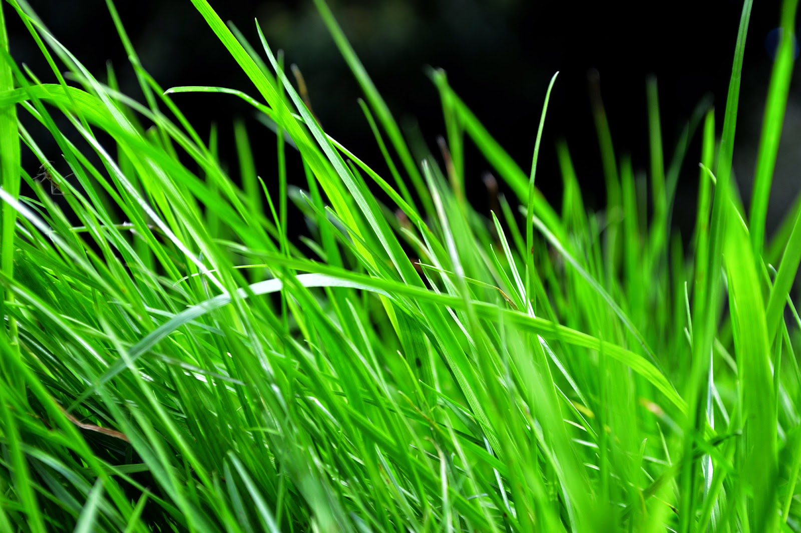
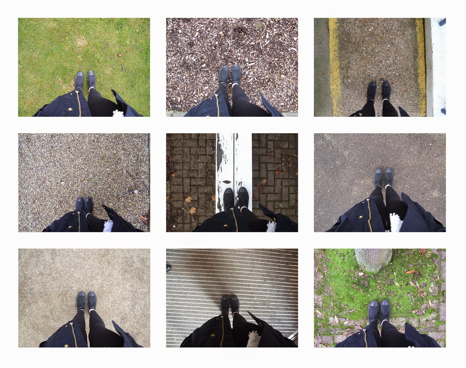
After looking at studio contrast we then began to look at contrast more generally. We completed a mind map of all what contrast consists of and how we could show this and then we completed two location shoots. I found location contrast one of the easiest topics to photograph because contrast can be a variety of different things and are very easy to find. I also found this quite creative because you had to be able to recognise the contrast and then photograph it in a way that would show the contrast effectively, for example one of my images showed the contrast between the moss in the pavement and the stones on top of the pavement, to show the contrast of this I took a very low angled macro shot, focusing on both the stones and the moss.

Overall I have enjoyed this unit because it has expanded my skills and taught me a lot of things which will be good to use when I start my own topic, for example, what may count as a good photo, what photos work for me and how to edit them to the best of their worth. This unit has also helped me to understand the formal elements and how they are very important for photography and evaluating work. From this I have decided that I would like to use a mix of the studio and location in my next unit as I like and feel comfortable photographing in both however I would not like to focus on one particularly because I feel that this would get repetitive and become boring whereas if I used a mixture of location and studio I would have some variety.

Monday 15 December 2014

20 Best Photographs

Connecting Essay

This is an image that I have taken and then used photoshop to add soft focus. I think this is effective because it covers up all of the imperfections, on my image I have left the opacity quite high so her face contrasts very strongly with her eyes and lips. Her skin looks very airbrushed and I think this is good because it makes her skin look clear and without imperfections. Her eyes and lips stand out very well because they are the only things in the image which are not blurred. I think this image is very effective because the background is very dark which means that you cannot see how this is blurred. 
This is a soft focus image that I found on the internet, this would have been produced on photoshop to cover up the imperfections of the women's face. The blur on this image is very weak which means the features do not stand out very well however there is a slight blur. The fact that the women's eyes are naturally very dark from her make-up also makes this image look very effective. This image was taken against a black background however there is a light area on the background near the women which makes her stand out and her skin appear very vibrant.

These two images are very similar because they are both showing soft focus and they are both also photographed against a black background, the difference between the backgrounds is that I have kept my image very dark however in the internet image it is slightly lighter with a more grey tone directly behind the model. The soft focus in my image is also much stronger than in the internet image as this is a very weak soft focus. In my image Ellie also has a very serious expression and seems slightly sincere however in the internet image the model appears to be pulling a pose and also smiling. The model in the  internet image also has blonde hair and in my opinion this makes her skin look a very bright colour as it of a similar tone however Ellie's hair contrasts with her skin because it is dark. 


Thursday 11 December 2014

Connecting Essay

This is my photo joiner image, to produce this I took lots of close-up, detailed images and then used a blank canvas on photoshop to overlap and merge the images. I like this image because it is slightly similar to his face as most of the images line up quite well however it does not fit together perfectly. I think this image looks very good as a photo joiner as although his face is very similar and almost fits together, the bricks in the background do not match up and I think this looks better. I have taken all of these image front on however if I was to produce this again I would maybe take some different images from different angles to vary it a little. The formal elements which are in this image are line because of the bricks in the background and also pattern as the bricks make up a pattern. 
This is David Hockney's  photo joiner of a face, he has produced this in the same method I used to complete mine. I like this image because he has used multiple viewpoints and constructed the image using the varied viewpoints. I think the use of the different viewpoints and angles is effective because it helps us imagine how the object would look as a 3D object. 

These two images are similar because they are both photojoiner's of people faces. Within both of these photos it includes the head and neck however in Hockney's image we can also see the woman's shoulders. I think it looks better with the shoulders because you can show all the different viewpoints in this image. These images are different because in my photo joiner I have taken all of the images from directly in front of him however David Hockney has has taken his from different angles and viewpoints. Hockney may also have taken these images from different distances from the model. 

Monday 8 December 2014

Connecting Essay

 
This is an image of a drain cover which I found on the internet, this image shows texture very well because we can see exactly how this drain cover would feel. This image is not very good because it was taken directly above the drain so we cannot see the depth within the image. This also isn't very good because the image is not very good quality as there is no variation in the colour. If this image was taken at a different angle it may improve the image because we would see shadows and a variety of colours slightly better. I think this image would also be much better if it was slightly closer up as this is very zoomed out. The entire composition is full in this image because the whole composition is taken up by the drain however as this was taken quite far away, the shapes are too small and this makes the composition less effective. 

This is my own image of a drain cover, I took this whilst looking at texture and think this portrays texture very well because I have taken this so that you can see the depth of the raised areas. This also shows texture because we can see the shadows on the different shapes. I like this image because I have taken it from an unusual angle and I have also taken this very close up which makes the image look better. I also think this picture is very effective because it is blurred in some areas however clear in others. I like how in this image the composition is full and this makes the picture more effective. 

These images are slightly similar because they are both taken of the same object however there are some differences between the two images. The internet image was taken from directly above the drain however I took my image from a low angle and in my opinion my photo is slightly better as it shows texture easier due to being able to see all of the shadows and also the difference between the colours. My image was also taken much closer to the drain and this means that my image has more depth because the shapes re bigger within the image. These are also similar however because in both of the images the whole composition is full. 

Thursday 4 December 2014

Pre-Completion Evaluation

We are close to finishing the first unit of photography, I think this unit has gone rather well. I think this because I have completed all of the work and feel that I have completed it to the best standard I can. I have also really enjoyed this topic as we have gone into more depth within our photographs, we have done this by focusing on separate formal elements as these are very important to look at whilst taking photographs. By focusing on separate formal elements it has made it easier for me to evaluate any photographs because I now realise that you need to focus individually on each element.

Whilst photographing the formal elements my favourite to photograph was still movement as I found this the most challenging of them all. To photograph movement we had to change the settings on the camera which meant I had to understand how to use my camera fully. We also had to try and find objects which moved which was not too difficult. I generally liked photographing the formal elements however because I felt that it meant I could use a variety of different areas whereas once I have chosen my own topic in the next unit I will always focus on this for example if I choose to do certain subjects I may often have to use the studio. Whilst I love using the studio it mixes it up a bit to go out and photograph on location. I really enjoyed photographing studio form as it meant that we had to turn the lights off and experiment with the lighting to create shading. It was more interesting to photograph if people were pulling silly faces because these created unusual shadows within the photographs.

I also really liked photographing on the walks and focusing on autumn colours as I felt I could create some very interesting compositions. I  like focusing on really close up, detailed images which are photographed using the macro setting. I find this very creative and these would be my favourite type of photo. I took some very effective macro photos of leaves, I felt that using the macro setting brought the colours out and made them look very bright and vibrant.

In conclusion I think this unit has gone very well however I do think that the next topic would be better because throughout this unit I have been learning how to use the different cameras, how to adjust the studio and also how to use photoshop however I feel I am comfortable using them now so the next unit will be much easier to do. I will also have a better understanding of what makes a good image meaning that out of the images I take, more of them will be picked to be edited.