Thursday 27 November 2014

Straight images


Image Bank

These images are all examples of Mapplethorpe's portraits, in my opinion these are very effective because Mapplethorpe fills the composition and his models facial expressions also give the composition more depth and meaning. The bottom four images in this image bank are all self portraits and some people say that he may have taken these as a way of exploring himself and his sexuality. I think his images are all very effective and find that his photography has a lot of meaning such as him photographing things to represent sexuality and the gay community. I would like to replicate him photography and do not think it would be too difficult to replicate as he often controls the models expression to seem very serious. 


This is one of Mapplethorpe's portraits of an older gentlemen. I like this image very much because I feel that the composition has been thought about very much as with this the models face is not in the whole of the frame, I think this works because we can see what he is wearing and it gives us an insight into what type of person he is. I also like how the model is pulling a very natural facial expression and looking directly at the camera. 


This is another of Mapplethorpe's portrait photographs however this is slightly different to some of his others due to being a self-portrait. I think this photograph works very well because Mapplethorpe has used very harsh lighting which links in well with him wearing a leather jacket and smoking. The composition of this is good because he has included his face above the middle of the picture. 


Thursday 20 November 2014

Work Diary

Thursday 20th November
During todays lesson we were looking at multiple imagery. At the beginning of the lesson Paul explained what multiple imagery was and how you put the images together and we went straight out to photograph. At first I was un sure of what multiple imagery would be so my first few images were not quite right so I went and spoke to Paul and he explained properly how to photograph the multiple imagery. I then went out to shoot again and this time I understood the task a little easier so was able to get more images.
This is one of my multiple imagery images, I like this image because I have photographed in a variety of different areas which means each of the images are slightly different however my legs and feet are almost identical in each image which makes all of the images fit in together. 
This is my second multiple imagery, I like this because I have used slightly different images of a bush. I have taken these images from different distances and also a variety of different angles. I think this fits together very well because all of the colours are very similar and this makes the entire composition fit in well together. 

Progress
I do not have many images completed as it took me a while to understand the task and then when I uploaded my images to the computer I found that most of my images were blurry as I had forgotten to check the settings of the camera and it was on manual focus instead of automatic focus. I would also look for more colourful multiple imagery objects as this would make it more interesting.

Straight images


Monday 17 November 2014

Connecting Essay

This is an image I have taken of some leaves in the grass. I took this image on one of our walks and it was taken to show autumn colours. I like this image because it is very colourful from the different coloured leaves and then the green grass. I also like the angle at which I took this photo, I took this from the ground so this image would be different from others. The formal elements which are very evident from this image are colour and form. Colour is very important within this image because we have the variety of shades of oranges and yellows from the leaves and there is also the green of the grass which contrasts slightly with the yellows. Form is shown by the shades on the leaves, this is very important because it makes something appear 3D and this helps us to understand the shape of the leaves. I think this image is very effective because it was taken on a sunny and that means that the colours of the leaves are very vibrant and in my opinion this is a very good representation of autumn colours.

This is an image I have collected off of the internet. This is an image taken from above of a pile of autumn leaves. The main formal element within this image is colour, this is because all of the leaves are slightly different shades of orange and browns. All of the colours are very similar and this makes the composition fit very well together. Line is also used in this image within the marks of the leaves, this is effective because again it uses similar colours and makes the leaves more detailed. I like this image because the entire composition is full and the image is very detailed. I also think this image works well to show autumn colours.


These images are very similar because they are both showing autumn colours by the use of the leaves fallen off of the trees. Both of the compositions are also full which makes the image more interesting as there is no wasted space. These images however are slightly different by the angle they were taken because the internet image was taken from above the leaves and my image was taken along the ground. I like both of these images because they are very colourful and effectively show autumn colours.

Connecting Essay

This is an image of a wooden bench that I have collected off of the internet. This image is good because it is a very close-up image and this means that we can see the grain of the wood very clearly. In my opinion this image shows texture because very well, I think this because we can see all the small markings and engravings in the wood and this makes us imagine how it would feel. This image could also shoe depth because as the bench gets further away from the camera we can see that it gets smaller. I think this image would be very easy to replicate because it is quite simple however not too simple as it includes all the detail of the texture of the wood. I like this as an image because although it only includes one object, being the wood, the entire composition is full and there is no wasted space. There is a strong use of line within this image, for example all of the marking in the wood are made of small lines and this creates the majority of the photo, tone is also used in this to show the texture.
This is an image I have taken of myself, this image is a very close-up image of a bench and I have taken this to show texture. Although whilst taking this image I was focusing on texture this image also shows depth. I like this image because at the bottom and the top of the image it is slightly blurred however towards the middle it is very clear and we can see all the detail. I think this Is effective because we generally focus on the centre of a photo and in this photo it is very clear however I like how it is blurred at the top and bottom because it shows how the bench is very close to the camera at the bottom and at the top it is slightly too far. I also like this image because I have used the macro setting and this has made the small detail within the wood stand out. The most important formal element within this image would be like because all of the groves are shown by lines and this has also shown us the texture of the wood.

These two images are very similar because they are both very close-up images of a wooden bench, to produce this photo I have used the macro setting on my camera and also assume that the photographer of the internet image has also used the setting as I feel that it would be very difficult to get such detail using a different setting. Both of these images show texture very well due to the strong use of line within them both and this is very effective because it makes the image detailed. These images both also show depth as we can see that the object is getting further away from the camera due to it getting smaller towards the top of the image, this is very effective because it makes it easier to see that this image is long and narrow. The composition of these images is also very similar because the bench fills the entire image and there is very little wasted space.

Work Diary

Monday 10th November
During this lesson we were photographing location contrast. At first I was unsure of what to photograph but once I understood this task was much easier. I found that there was quite a bit of location contrast around college and I feel that I have a variety of different location contrast images. I used all of the time available to photograph this topic as I felt there was such a range of things to show contrast.

This is one of my location contrast images, I like this image because I think it is very obvious that is it showing contrast as the two halves of the image are showing different textured materials however they are a similar colour which emphasises the contrast of the textures. To improve this image I should have included more of the top material so the split was more central. I think I could have also tried photographing this image from a few different angles because it may have looked slightly better from a different angle. 

This is another of my location contrast images. I like this image because not only is there the contrast between the colours of the two objects but there is also the contrast between the patterns within them for example the left of the image is bricks and they are a variety of colours whereas the right is a lined patterned surface in black and white. I also like this because I think I have centred the contrast very well and think this looks very effective. 

Progress
If I was to go out and photograph location contrast again I would try and find some different areas as there may have been other, more interesting examples of contrast in other areas such as in town or around the areas of college. I also quite liked the images where I contrasted with clothing such as the leather sleeves and the different coloured shoes so I think it would be good to try and photograph more images like this. 

Straight images


Definition post

Dictionary definition
'The state of being strikingly different from something else in close association'


These are all examples of contrast photography. These show contrast very well because they all have such obvious differences between the objects within the image, for example the first image shows the contrast in the colours of the apple by showing all green apples and then having one single red apple, the second shows the green and red peppers that are next to each other however they are separated and also different colours, the third image shows loads of coffee beans and then there is one single green m'n'm, this is similar to the first image of the apples and then the last image shows the two different types of ground, the green grass and the mud, this is good for contrast because there is an obvious line separating the two. 

My definition
The distinct difference between two things

Work diary

Thursday 13th November
During this lesson we went on our second walk, the purpose of this walk was to get more images of what we missed on the previous walk, therefore I knew I should focus on a sense of journey and back of heads because during the first walk I focused on autumn colours. This walk did not go very well because my battery on my camera was too low which meant using a college camera and then once we were on the walk, the battery on the college camera was low. Therefore I did not take as many photographs as I maybe could have with a camera with full battery. I also still stubbled to photograph a sense of journey therefore there was still a very limited about of journey images however I was able to take a wide range of back of head shots this time. 

This is one of my sense of journey images, I liked this image because it showed a sense of journey in more than one way. Not only is there a road with cars driving but there is also a slight bit of path to show where someone could be walking but there is also the bench where someone of a journey could take a seat. To improve this image I could have included more of the path in so it was clearer that this also showed journey and I also would have preferred to have taken this image on a sunny day as I feel it looks very dull and miserable. 
This is one of my back of head shots, i like this back of headshot because the background of the image is very pretty however also quite simple. I also think the colours of the image all go together very well for example Ellie is wearing a green jumper and a brown scarf which are both colours we could associate with nature. To improve this image I will need to crop it because it is slightly too zoomed out and we can see too much of Ellie's body. 

Progress
To improve this walk I would go out around the same area and photograph again however I would like to do so on a sunny day as I think the images come out better when it is sunny. I also would make sure my camera had full battery so I could take a lot more images and even try to photograph the close-up leaf images that I had taken last time however making sure they are not blurry.

Robert Mapplethorpe video notes

Robert Mapplethorpe

Born: 1946 in New York

Died: 1989 of AIDS

·       Lived in suburban American as a child however moved to Brooklyn at the age of 16.
·       Went to the Pratte institute of art, which is where he was introduced to photography and where he also met his close friend Patti Smith.
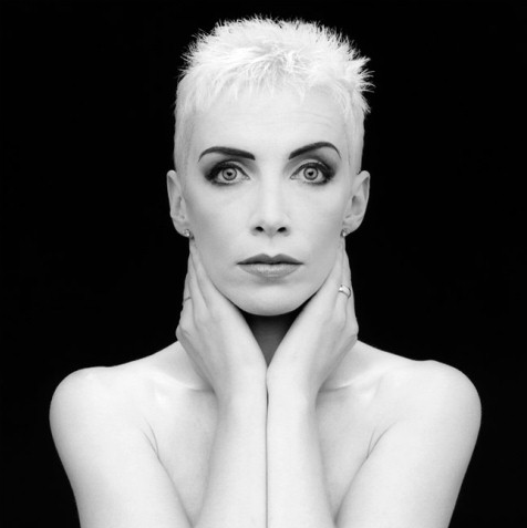
·       He is best known for his portraits, mainly black and white, which were occasionally used on album covers.
·       He documented Manhattans gay community, this caused some controversy because he was also part of the gay community.
·       He was brought up as a catholic and when he came out as gay he told his mother but not his father.

·       He also did some photography of flowers which were very effective however he did this purely for the money.


·       Americas most controversial photographer

·       Transformed the face of Americas fashion industry

·       In his portraits we see between mainstream and AC’s drug underworld

·       He knew how to get money

·       Focused on sex, violence and race

·       His work is ambiguous

·       He didn’t set out to shock, he was being selfish and it was about what he wanted to see

·       Greatest American photographer of 70’s and 80’s

·       Content of his photographs is controversial

·       Bridged the gap between shocking and sensible

·       “Robert captures people, he really captures people”

·       Best friend Patti Smith was his flat mate

·       Always very positive, never negative

·       His signed portraits sold for $15,000

·       “one mans celebration is another mans decadence”


·       Felt obliged to photograph people in a way that had not been done before

He was photographing the life he lived.