Monday 20 October 2014

Image bank

These are some examples of back of the head portraits. In these images the photographer has often turned the camera portrait to include all of the girls hair. In all of these images the photographer has placed the model in the middle of the image however it may be more interesting if there were to one side. I think these images are all very effective because almost all of the hair is included in the photograph and I think this makes the composition better because we can see the majority of what is trying to be included in the photographs. When photographing back of head I would like to make sure I  rotate the camera to do the same because I like the compositions of these photos and think they would be reasonably easy to replicate. 


This is an example of a back of head portrait, however this is slightly different to some of the other examples because the model has her hands on her hips and photography has captured some of this and I feel that this ruins the photo very much. 


This is a very good example of a back of head portrait because the photographer has rotated the camera so that the picture is portrait and has also zoomed out far enough so that we can see the ends of her hair and slightly above her head also. I also think this is a good example because the photo is very natural due to being taken against a very natural setting such as a room and I think the colours all work very well together also. 


Work Diary

Wednesday 20th October
We were also tasked to take back of the head portraits at a location. These images involved taking a portrait of the back of someones head with an interesting background however trying to blur the background at the same time. I found this very difficult as it was difficult to blur the background using my camera unless I was very close to the persons head. I also found that I was focusing too much on blurring the background and so many of my photos have objects in them which should not have been included in the photo for example pipes and wires.

This is one of my location back of the head portraits. This image is an example of one of the images where I focused on blurring the background and included a pipe which would look better if it as not included. If I wanted to include this photo in my straight images I would need to crop the pipe out. This is also an example of how i needed to zoom in very close to the back of the persons head to blur the background as we can only see the top half of the persons head not from their shoulders upwards.

This is another of my photos from this lesson, I feel that this is slightly better than the image above however in the image, the white line is not straight so I would have to straighten the image so this was vertical and i would also need to crop the left hand side as someones shadow is in the way. 

Progress
If I was to repeat this lesson I would make sure I was looking deeper at the backgrounds of my pictures and try not to include unwanted objects and I would also try and find some more interesting locations as some of the areas we used were very similar. I would also like to have a longer time whilst photographing this as I found it sometimes took a few attempts at the same photograph to get the image how I intend for it to be.

Work Diary

Monday 20th October
Today we were tasked to take portrait photos in the studio. I liked this task as I would like to start using to studio more and get more familiar with the equipment. We photographed the back of peoples heads rather than they're faces however as we wanted to focus more on the composition in general than the faces and facial expressions. I found this task reasonably easy and also enjoyed working in the studio however found we had very little time to take photos of all of the models with a variety of backgrounds.
This is one of my back of the head studio portraits, I like this image because it is slightly interesting how he is to the left instead of directly in the middle and I also like how he is facing straight forward so his head is at a straight angle. To improve this picture I need to change the levels and curves and also use the clone tool to cover up the dark spots on the backdrop.

This is another of my studio portraits. I like the image because similarly to my image above, the head is to the left of the picture and this one is also slightly closer and more zoomed in however I would need to retake this image as it is blurry. 

Progress
If I was to have more time in the studio I would try and take more images with a variety of background colours as the majority of my backgrounds are white. I would also experiment with my shot angles as it may make the composition more interesting and next time I would also maybe take two photos of each position as one may be blurry so I can use the other. 

Straight Images


Straight Images


Sunday 19 October 2014

Adam Burton

Adam Burton is one of the UK;s leading landscape photographers and he is also an author. Since 2008 he has been working as a full time professional landscape photographer, he has previously photographed five of the seven continents however he know focuses of the UK. He first began teaching himself photography in 2001 by reading magazines and doing plenty of practice. This way of learning has meant that he has a unique style of photography which makes his work recognisable. His work has been regularly published in national newspapers, magazines and also in books, greeting cards and calenders.
Burton likes to work during dawn and dusk as he feels the natural light is at its best. He also uses equipment to enable him to capture the beauty authentically rather than relying on computer enhancements.
I chose to look at Burtons work because I think his technique for taking photos is very professional however his work is also very unique and show the formal element of reflection.
This is Adam Burtons photographs over a lake. This photograph shows reflection very well as he has taken the photo at dusk and this has meant that the reflections of the different colours in the sky have reflected in the water as well as the mountains and scenery.

This is another of Adam Burtons photographs over a lake, this image however is slightly different as he has taken the photo at a different time of the day so it is much brighter and we can also assume by the snow that it was taken at a different time of year too. I like this image as it looks very serene and the water looks crisp.
This photo of Burtons is again taken over a lake however this has a very different background. This was taken somewhere more green than the other images which where near mountains. This image looks very natural and the colours are also very precise. This image also shows reflection as you can see the reflection of the tree and green hills on the water, the colour of these also contrasts with the brilliant blue of the sky.
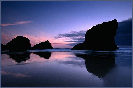
This is my final example of Burtons work. This image is slightly different to Burtons other images because this was taken of the coast. This image shows some coastal landforms during sunset, similarly to the first image, he has used this time effectively to capture the colours of the sky in the water and the landform is also reflected however it is just dark and we cannot see clearly what this is.

Influence
Adam Burton's work has influenced me because I think his work is very natural as he does not use editing equipment, he chooses to use equipment whilst taking the photograph to enhance the photograph. I think his work is very effective because he takes the photos during dawn and dusk and this means that there are some very vivid colours and in some of his images you cannot see the detail of the object such as the mountains and this makes the colours in the background stand out. The image below is one of my own images, I took this during my spare time however the composition was influenced by Burton's work. I like his images of lakes and the reflection within the water and I have tried to replicate that within this image. I think that I have replicated his work rather well because the reflection of this image is very vivid and the colours are also very bright and eye-catching however if I was to try this again I would use a different location because in Burton's images the landscapes are slightly different colours such as blues whereas my image is more green with the hint of blue in the sky and reflection of the sky.

Summary
When I originally looked at Adam Burton's work I did not find it interesting however after looking at his work in more detail I began to find his work slightly more intriguing as I noticed the different formal elements within it. I also noticed how bright and contrasting the colours were within his images and this is what attracted me to them because they were eye-catching.


Friday 17 October 2014

Definition post

Dictionary definition 
 'the art of painting or taking portraits'

Words to describe portraiture:
-profile
-characterization
-depiction
-figure
-image
-model
-painting
-photograph
-silhouette
-sketch
-snapshot


These are some examples of portraits, I chose these photos because in my opinion they all show some form of emotion through the facial expressions, these are all also very close-up images, making them more effective at showing emotion, for example in the last image the girl seems slightly upset and if she's pleading for help as her eyes look very big and also very dark. I like these images and think they show a variety of different portrait types.

My Definition 
an image or photograph of someones face, often showing an emotion

Thursday 16 October 2014

Image bank

These are some examples of portraits photographs, portraits can either be in colour or black and white as both are effective. I chose these images because I felt they all showed emotion through facial expressions. I like how the composition of all of the above images is very different which makes all of the images unique. The focus point of most portraits is the eyes and I feel that in the above images eyes are all very important. 


This is a black and white portrait of Angelina Jolie, this is a very well composed portrait because the model is centred slightly to the left and she is also side on which makes the image different to some others, De to being black and white it is also easer to see the form of her face and neck which makes her look very slim. The use of the hat is also good because it takes up the majority of the frame to prevent wasted space whilst her eyes are still centred making the image look very professional. 


This is a coloured portrait of a young girl outside with trees and greenery in the background, this works very well because we associate children with being adventurous and this could explain why there is greenery in the back ground and her hair is also not perfectly groomed. The photographer has also made the model look directly into the camera which has worked very well as the photo looks very dramatic. 


Work Diary

Thursday 16th October
Today we were tasked to photograph shape, originally I was a little confused as to what defines shape however once it was explained to me I realised that everything fit under the topic of shape because everything has an outline. This meant there was a wide range of images I could take. I liked the task however I am not very happy with my images as i used the college camera and feel that these are not quite as good quality as my own camera.

This is one of my shape images. I like this image because the leaf has a very nice shape and the contrast between the shape of the leaf and the white background I placed it on is very effective. I do not like this image however because I feel that this image is very dark and needs a lot of editing and if I had taken it with my own camera then it would be much better quality. 

This is another of my shape images. I also think this represents shape very well because there is the heart image and there is also the triangles. There is a range of shapes in this image. To improve this image I need to change the levels and curves as this image is also very dark. I could also crop out the corner as there is a very dirty area. 

Progress
If I was to go out and shoot shape again I would use my own camera because I feel that my camera produces much better quality images. I would also check the settings on the camera as all of my shape photographs were very dark. I would also like to try and take more images similar to my leaf image as I think this represents shape very well because there is nothing in the background. Finally I think it would be very effective if I explored some new areas so I am not using repeated areas in my photographs meaning that it may be difficult to decide which formal element the photograph is showing. 

Electronic Portfolio

Straight images


Tuesday 14 October 2014

Work Diary

Wednesday 8th October
During this session we began to photograph texture however the desired conditions to photograph texture changed so we began to start our photojoiners instead. To create a photojoiner you must take lots of very detailed, close up images of something and then using photoshop, put them together to create an image again. We were tasked to make a photojoiner of a person, object and building. I made my building photojoiner and found this extremely easy to photograph because you can use parts of the building, for example windows to get similar sized images of the building as these would make the photojoiner look more accurate. When originally explained how to do the photojoiner on photoshop I was a little confused however it didn't take me long to et the hang out of it. My second photojoiner was of a bush, this was not too difficult and I also liked making this however my third was a person and I struggled to do this because many people did not want to be photographed however once I had found someone to photograph they then had to stand in the same position and pull the same facial expression, I struggled slightly with this task however once it was done it was ok.

These is one of my photojoiners. I think this is put together very well as the image looks true to the original object however I feel that the image is very dark and next time I will complete my photo joiner on an object in a better lighted area. I also like how within this image the background almost lines up however to improve this I should have taken images of the grass either side the base of the tree because I do not like how there is a white space either side. 


This is another of my photojoiners, again it is very similar to the original building however there are some slight differences. I like this photo joiner as it is nice and bright because I chose a well-lit area. i also think making a photojoiner of a building is much easier because you can use the dimensions of the building to work out what areas to photograph and you end up with a very nice range of images to use to make the photojoiner. 

Progress
If we were to go out and complete a photojoiner again I would make sure to take extra images of the object in case one fit better than a similar image as I feel this would improve the accuracy of the image and I would also take closer photos as I feel mine were a little too zoomed out which meant I did not need to include too many images to complete one image for the photojoiner.

Lee Towndrow

Lee Towndrow is a visual artist based in New York. He began his career as a designer and photographer at a designer firm which he founded, the firm was best known for its work creating the album covers for Canadian bands such as Sloan, The Flashing Lights, The Inbreds and Michelle McAdorey. He then became a flame artist where he created visual effects and designs for TV commercials, music videos and feature films. He moved to Beunos Aires briefly between 2004 and 2005 where he worked with Roberto Jacoby. His work appeared in Time Magazine, The Paris Review and Das Magazine.
I chose his work because I think he uses and represents the formal element of colour very well. He does this by using very bright colours and also by contrasting the bright colour with other colours such as white or black backgrounds. 

This image shows a dog wearing a ginger wig, this image shows colour very well because the dog and the background are all white and this contrasts very well with the ginger wig. I like this image as i think it is quite usual how he has placed the wig on the dog and then made it seem as if the dog is flipping its hair to the side. The use of the copper coloured necklace is also very effective at showing colour because again it contrasts with the dogs white fur and the white background. 
This image shows a man wearing a black hood and white outfit and they have had yellow paint poured over their head, I think this photograph is very effective at showing colour because the hood and background are black, the outfit is white and these are both very dull, basic colours and then the yellow paint is poured over the person and the yellow is very vibrant and stands out very well. The fact that they have photographed the paint dripping was also very effective at showing colour because it is over the black in strands ad this looks very unusual.
This image shows a women's face, The women has turquoise hair and is also wearing a pink swimming cap and pink outfit. There is a lot of contrasting of colour within this image, for example there is bright pink on the swimming cap, on the women's outfit and also in the women's bright pink makeup. The pink contrasts very well with the turquoise background and also the turquoise hair and finally the natural colour of the women's skin tone also contrasts again. I like this photo because it is very bright and the colours and vibrant and contrast with eachother. I also like the whole composition because the colours seem to be separated with the turquoise on the left and the pink on the right.
This photo is not a very clear photograph showing colour however in my opinion it does show colour because of all the very blue tones within the image. There is a lot of blue lighting within this image and because of this the entire image looks blue, for example the woman's dress is a light shade of blue and there is a blue shaded mist. The blue lights are also reflected off of the trees and this makes the entire image very blue. I think this image is very interesting as it also includes the repetition of the woman in the thin dress walking in different areas in the image. There is leo the repetition of the lights in the image. 

Influence

I find Lee Towndrows work to be very influential, in my opinion he fills the compositions of all of his pieces very well as they do not have to be extremely busy however they are still interesting and eye-catching. I also think Towndrow uses colour very effectively by either using very similar colours within an image or by doing the opposite and using colours with completely contrast with each other. 

Summary

I like Towndrow's style because I do think he has a rather unique style in using colour. His work also interests me very much with the use of bold colours and I would quite like to study him further and maybe try his style within my own work. The only improvisation I could make to his work would be to use a wider range of subjects, for example the first three images above use contrast to show the colour.